ToastProv1.0.0
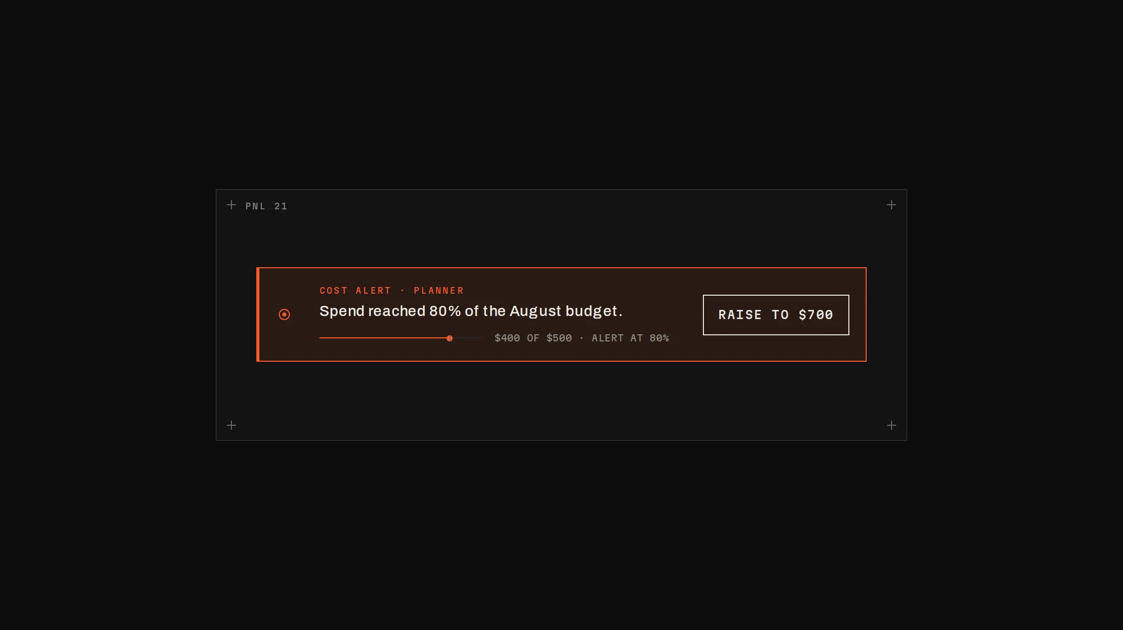
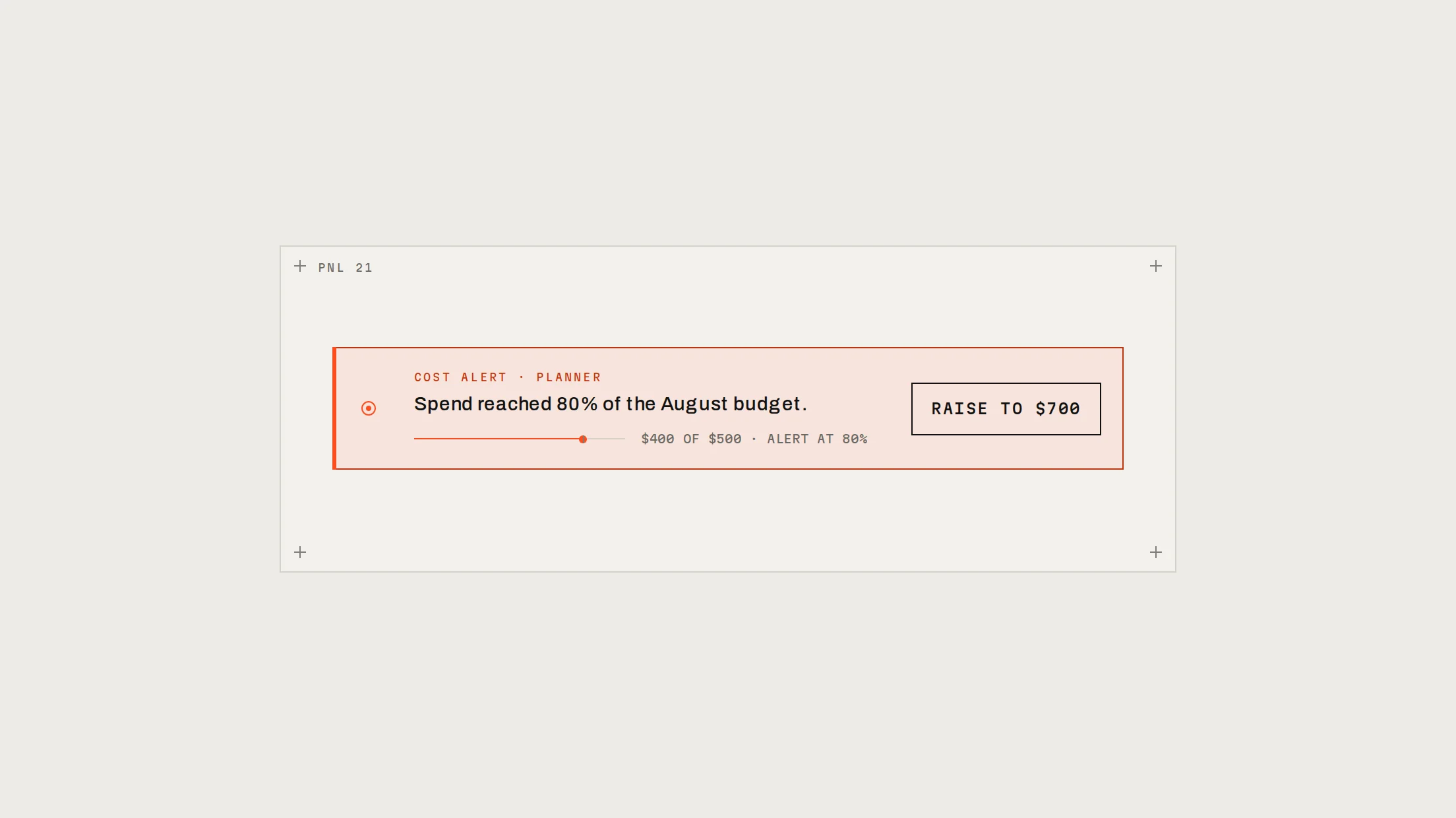
A toast() call and a Toaster in Notchset: toasts stack without overlapping, newest at the bottom, three at a time, each with a node, a mono meta line, an Undo that sends its inverse, and a 2px countdown line that pauses while you hover.
Live preview
Installation
pnpm dlx shadcn@latest add @beautiful-ui-pro/toastNeeds your registry key. Your components.json style picks the Base UI or Radix build: radix-*, new-york and default get Radix, base-* gets Base UI.
Styles didn't apply?
The CLI adds the styles to the CSS file named in components.json (tailwind.css). Check that it points at your global stylesheet, that the project uses Tailwind CSS v4, and that the file is imported in your root layout. Installed by hand: paste styles.css into that file.
Usage
Import it and pass your content. The props that matter most are listed next.
Example
"use client";

import { Toaster, toast } from "@/components/ui/notchset/toast";
import { Button } from "@/components/ui/notchset/button";

// Once, in your root layout (inside <body>).
export function AppToaster() {
  return <Toaster />;
}

export function PromoteButton({ rollback }: { rollback: () => void }) {
  return (
    <Button
      onClick={() =>
        toast("Planner v14 is live", {
          meta: "PROD · 100% TRAFFIC",
          action: { label: "Undo", onClick: rollback, then: { title: "Rolled back to v13" } },
        })
      }
    >
      Promote v14
    </Button>
  );
}
Props
toast(title, options)–{ meta?, tone?: 'default' | 'warn', action?: { label, onClick?, then? }, duration? }Shows a toast; returns its id. `then` replaces it after the action (an Undo's inverse).
toast.dismiss(id?)–functionDismiss one, or all.
Toaster–{ max?, duration?, label?, dismissLabel?, hotkey? }Place once. 3 visible, 5000ms, Alt+T focuses the stack.
Source
components/ui/notchset/toast.tsx
This component is included with Pro.
Try the live preview above. Get Pro to install the source.