Page Header
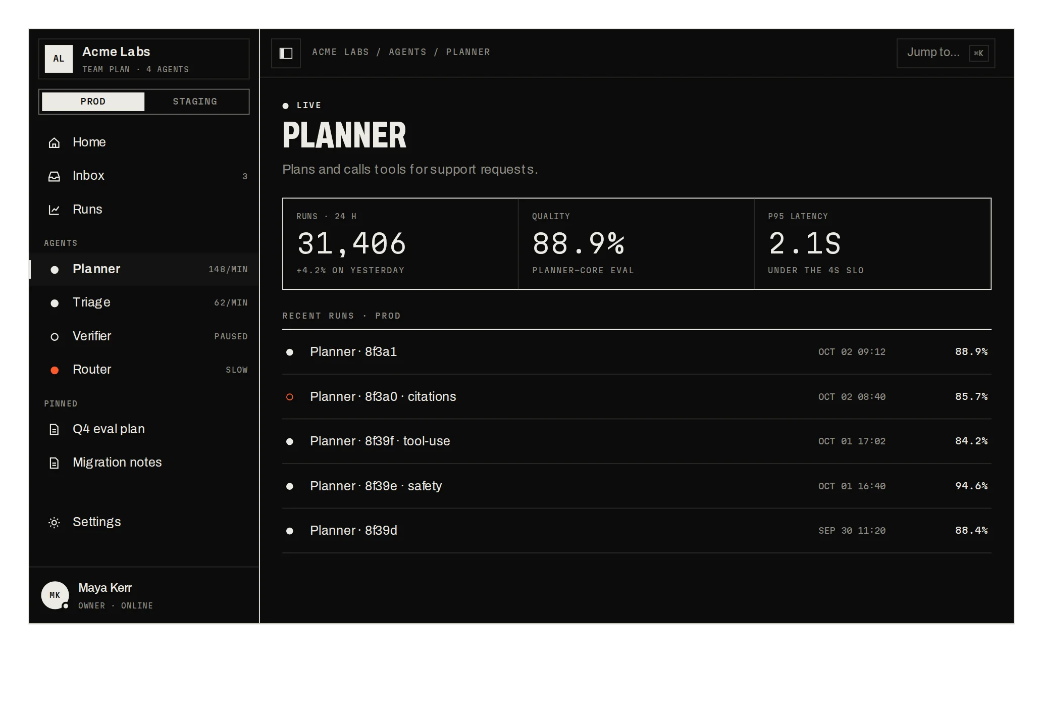
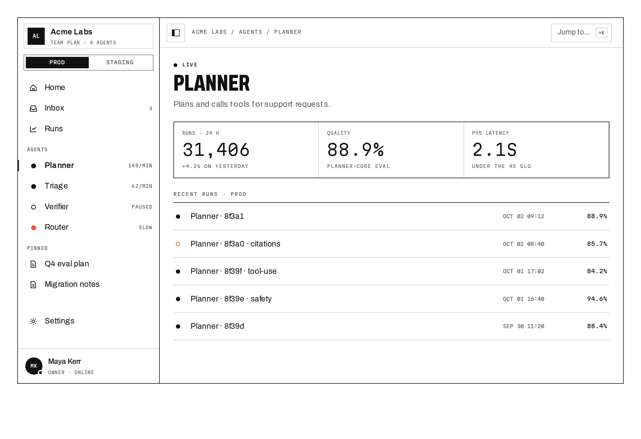
Prov1.0.0A detail page header with breadcrumb, actions, status and tabs that folds on scroll.
Build for your project
Code/install build
Usage
Import it and pass your content. The props that matter most are listed next.
Example
"use client";

import * as React from "react";
import { PageHeader } from "@/components/ui/notchset/blocks/page-header";

export function AgentHeader() {
  const [tab, setTab] = React.useState("overview");
  const [status, setStatus] = React.useState("live");
  const [following, setFollowing] = React.useState(false);
  return (
    <PageHeader
      breadcrumb={["ACME LABS", "AGENTS", "PLANNER"]}
      title="Planner"
      statuses={[
        { value: "live", label: "LIVE", tone: "live" },
        { value: "paused", label: "PAUSED", tone: "paused" },
      ]}
      status={status}
      onStatusChange={setStatus}
      following={following}
      followers={12}
      onFollowChange={setFollowing}
      primary={{ label: "NEW EVAL RUN", onAction: () => "EVAL RUN QUEUED" }}
      tabs={[
        { value: "overview", label: "OVERVIEW" },
        { value: "runs", label: "RUNS", count: "31,406" },
      ]}
      tab={tab}
      onTabChange={setTab}
    >
      <p>Tab content</p>
    </PageHeader>
  );
}
Props
breadcrumb / title / description–string[] / string / ReactNodeThe path (its last part hides when the condensed title appears), the 52px title and a line under it.
people / meta–{ initials, name? }[] / { label, value }[]Avatars and the meta line; a person without a name is a +n chip.
statuses / status / onStatusChange–{ value, label, description?, tone }[]The status pill and its menu; tone is live, paused or degraded.
following / followers / onFollowChange–boolean / numberFOLLOW: the bell fills and the count rolls.
shareUrl–stringSHARE copies it and shows LINK COPIED.
actions–{ id, label, shortcut?, tone?, onSelect? }[]The ⋯ menu; return a string to confirm in the toast.
Show all 9 propsShow fewer
primary–{ label, onAction }The ink button; ⌘↵ runs it from anywhere in the block.
tabs / tab / onTabChange–{ value, label, count? }[]Tabs with counts; the underline stretches between them.
children–ReactNodeThe selected tab's content; it scrolls under the header.
Anatomy
- One block; the tab content is yours.
- Status, follow and the main action are controlled, so they persist where you keep them.
- Menu actions confirm themselves in a toast when they return a message.
PageHeaderdata-slot="page-header"The header and the scrolling tab content under it.
Source
components/ui/notchset/blocks/page-header.tsx
This component is included with Pro.
Try the live preview above. Get Pro to install the source.
Build for your project
Code/install build
Installation
pnpm dlx shadcn@latest add @beautiful-ui-pro/page-headerNeeds your registry key. Your components.json style picks the Base UI or Radix build: radix-*, new-york and default get Radix, base-* gets Base UI.
Styles didn't apply?
The CLI adds the styles to the CSS file named in components.json (tailwind.css). Check that it points at your global stylesheet, that the project uses Tailwind CSS v4, and that the file is imported in your root layout. Installed by hand: paste styles.css into that file.
For coding agents
Give your coding assistant the Markdown guide instead of screenshots.
Use it for
- The top of a detail page (an agent, a project, a customer) with its status, people and main actions
Use something else when
- A list or index page: a smaller heading and a filter bar fit better
- A site header: use Site Header
Mistakes to avoid
- Give the block a height (640px by default): the header condenses on the block's own scroll, not the page's
Agents find it by
- page header, entity header, detail page header, sticky header, condensing header, tabs with counts, status menu, Notchset
Where agents read it
- Guide for this component: https://beautiful-ui.dev/md/page-header.md
- Every component, for tools without MCP: /llms.txt
- MCP server:
https://beautiful-ui.dev/api/mcp(setup)
Behaviour
Keyboard
- ⌘↵ / Ctrl+Enter
- Run the main action
- ← →
- Move between tabs
- ↑ ↓ Home End / Esc
- Move in a menu / close it
Accessibility
- The breadcrumb is a nav with the current page marked; FOLLOW is a toggle button (aria-pressed)
- The status and ⋯ menus are menus with arrow keys; Esc closes them and returns focus to their button, and a press outside closes them
- Tabs are a tablist with arrow keys; the content is a tabpanel labelled by its tab
- The folded title block is inert; SHARE's confirmation and the toast are announced
Motion
- Condense
- Past 28px the title block folds (360ms) and the name and status slide into the top row 120ms later
- Tabs
- The underline stretches between tabs (340ms); content rises in
- Menus
- Unroll on grid rows (320ms), roll up faster (180ms)
- Follow
- The follower count rolls
Responsive
- The top row wraps its actions under the breadcrumb on narrow widths; tabs scroll sideways.
Performance
- Plain DOM; the condensed state changes once each way, not per scroll frame.
Changelog
v1.0.0 · 2026-10-03
First release
Part of
Included with Pro
Pro is in early access.