Layout Morph
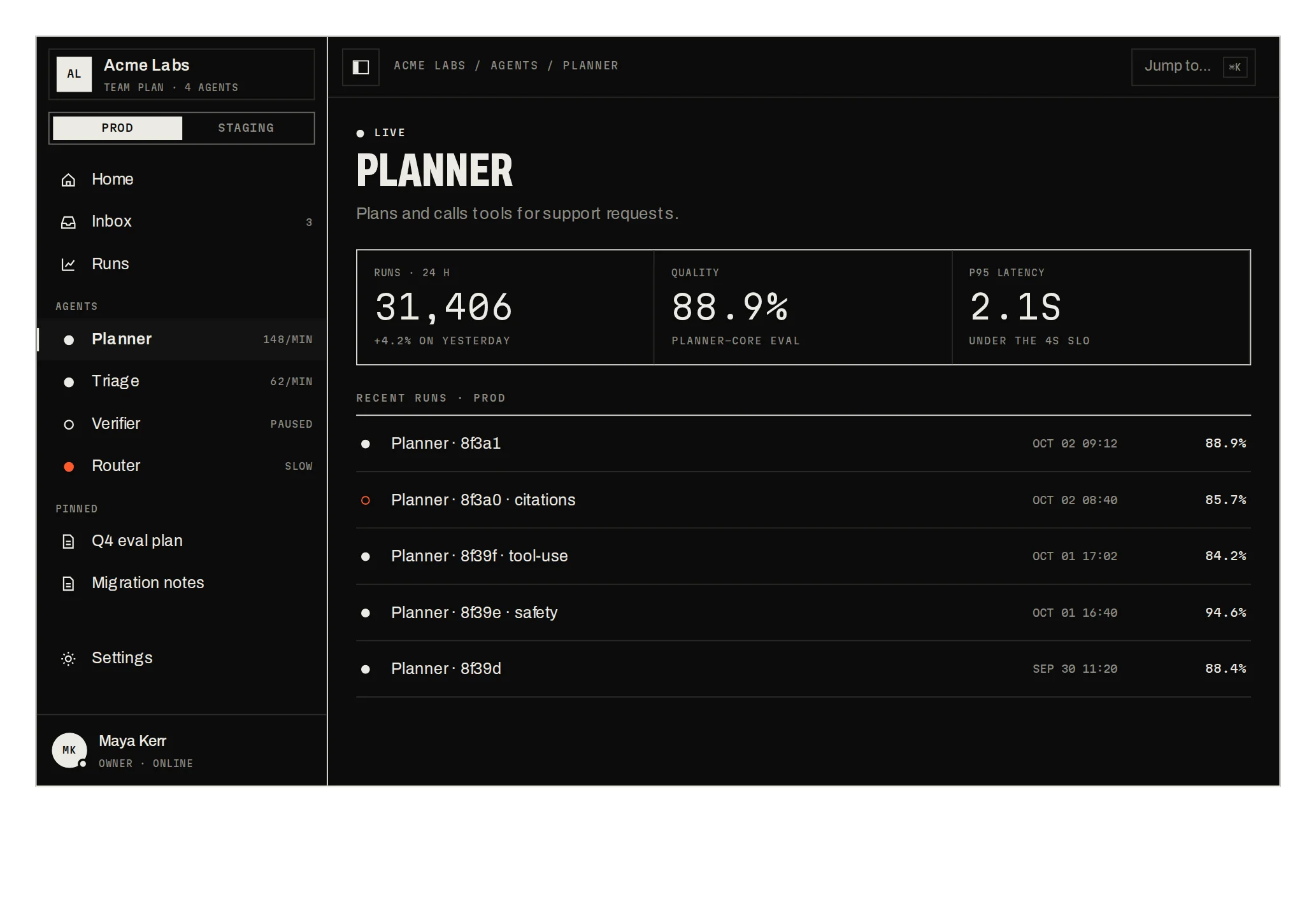
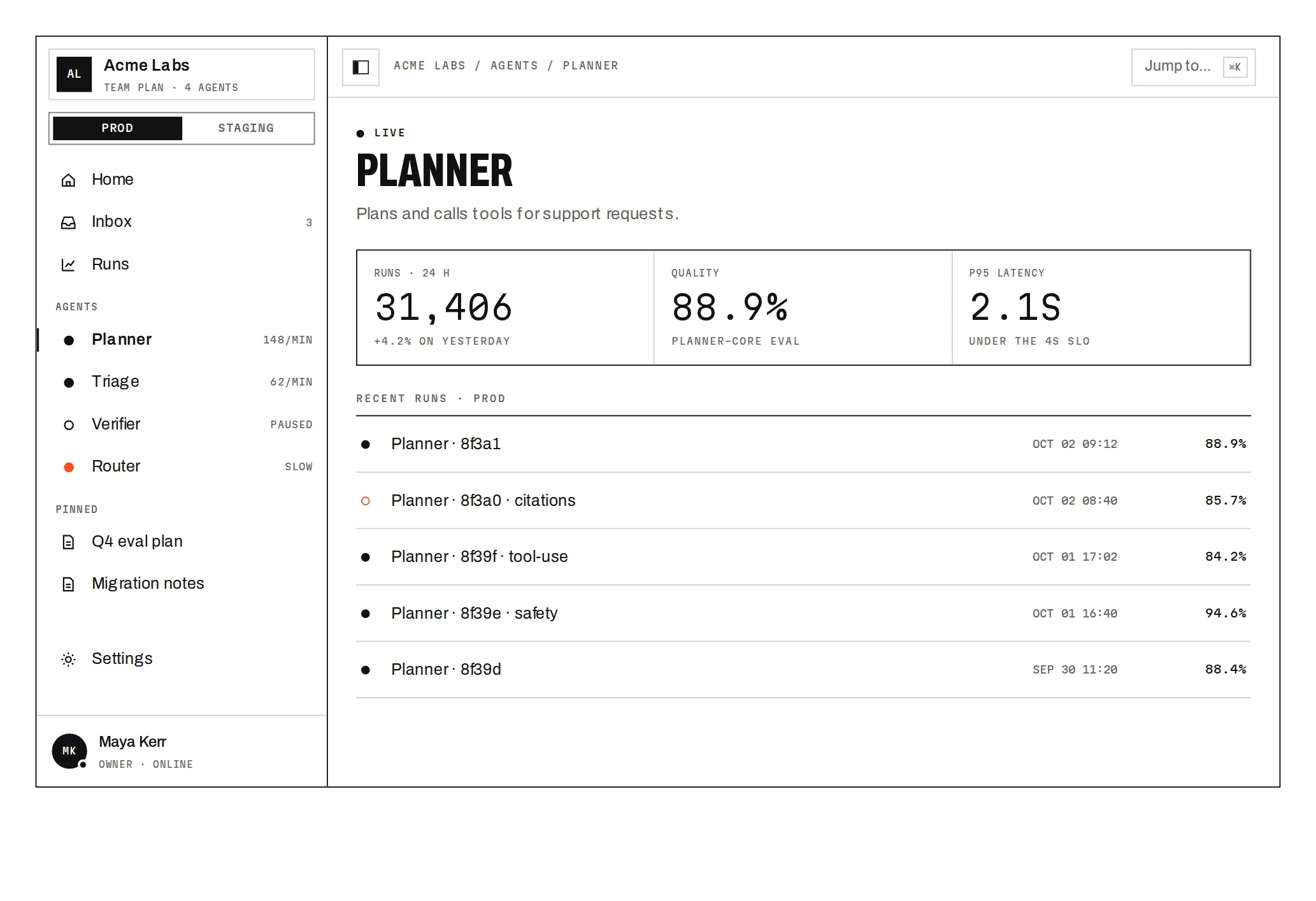
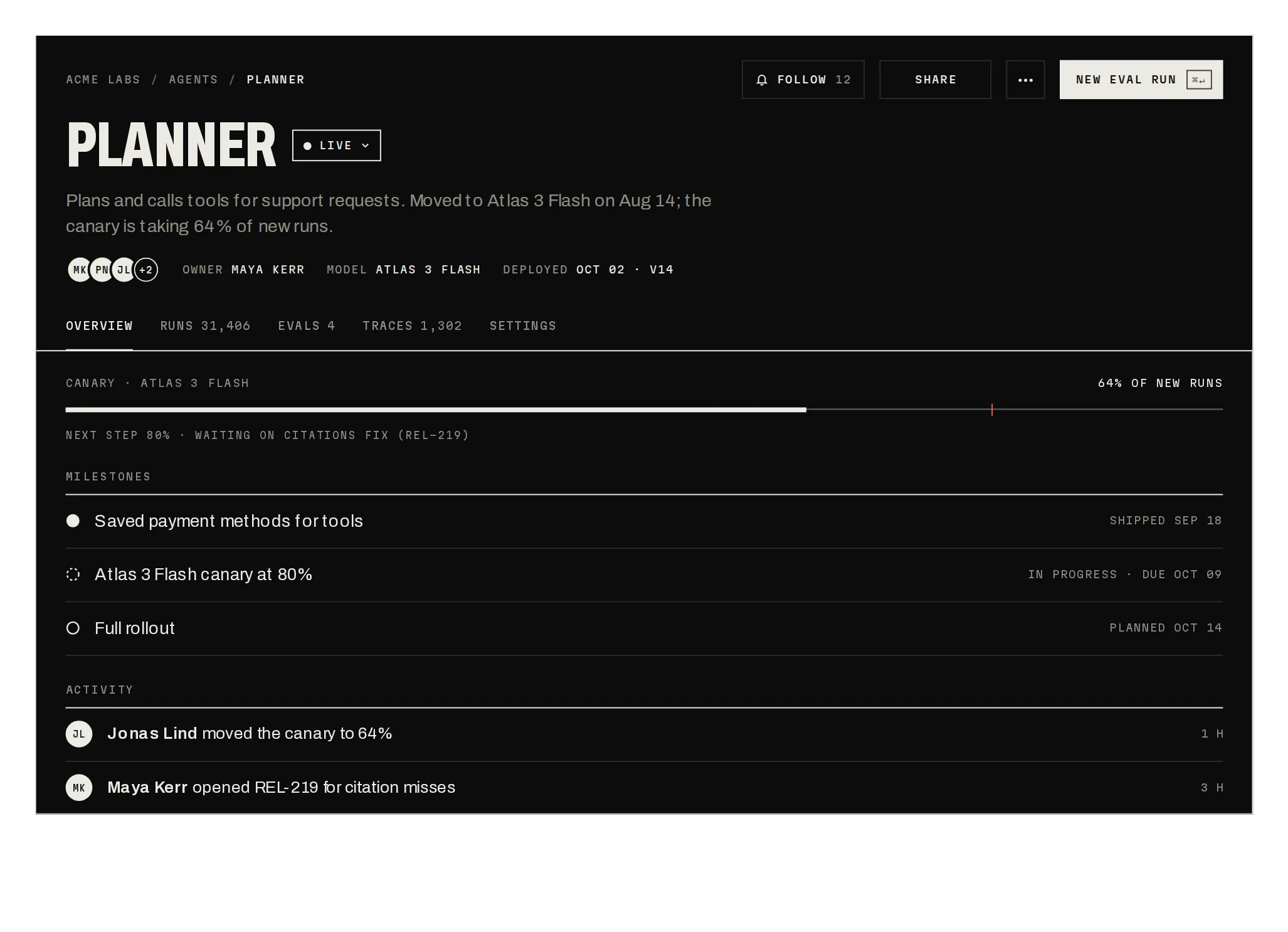
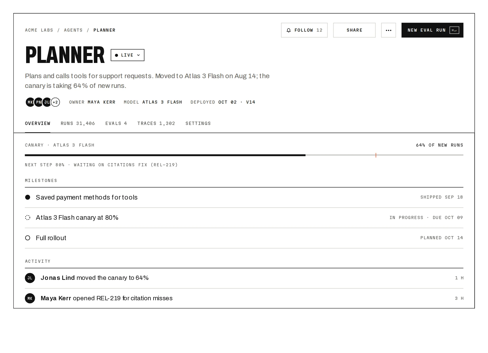
Prov1.0.0A card library that morphs between grid, list and grouped views, every card travelling to its slot.
Build for your project
Code/install build
Usage
Import it and pass your content. The props that matter most are listed next.
Example
import { LayoutMorph, type MorphItem } from "@/components/ui/notchset/blocks/layout-morph";

export function Library({ agents }: { agents: MorphItem[] }) {
  return <LayoutMorph title="Agent library" items={agents} groups={["PLATFORM", "GROWTH", "SUPPORT", "RESEARCH"]} />;
}
Props
items–{ id, name, group, model, runs, quality, ageDays, cost, icon? }[]icon is a 14×14 stroke path.
groups / groupLabel–string[] / stringThe groups in order and the group view's label (BY TEAM).
ages / threshold–{ label, maxDays }[] / numberBY AGE columns, and the quality below which the number reads in signal (85).
Anatomy
- Hover previews a card's numbers; a click pins them.
- BY AGE sorts youngest first within each column.
- Unknown groups fall into the first column.
LayoutMorphdata-slot="layout-morph"View control, the morphing stage and the detail strip.
Source
components/ui/notchset/blocks/layout-morph.tsx
This component is included with Pro.
Try the live preview above. Get Pro to install the source.
Build for your project
Code/install build
Installation
pnpm dlx shadcn@latest add @beautiful-ui-pro/layout-morphNeeds your registry key. Your components.json style picks the Base UI or Radix build: radix-*, new-york and default get Radix, base-* gets Base UI.
Styles didn't apply?
The CLI adds the styles to the CSS file named in components.json (tailwind.css). Check that it points at your global stylesheet, that the project uses Tailwind CSS v4, and that the file is imported in your root layout. Installed by hand: paste styles.css into that file.
For coding agents
Give your coding assistant the Markdown guide instead of screenshots.
Use it for
- A library people browse in more than one arrangement
- Showing how items regroup by team or age
Use something else when
- Hundreds of items: use a virtualised table
- A single fixed arrangement: use a plain grid
Mistakes to avoid
- Keep item ids stable so cards travel instead of remounting
- Keep the list to a few dozen; every card animates
Agents find it by
- view switcher, grid list toggle, kanban grouping, card library, agent catalog, morphing layout, Notchset
Where agents read it
- Guide for this component: https://beautiful-ui.dev/md/layout-morph.md
- Every component, for tools without MCP: /llms.txt
- MCP server:
https://beautiful-ui.dev/api/mcp(setup)
Behaviour
Keyboard
- ← →
- Change the view
- Tab then Enter
- Pin a card's numbers
Accessibility
- Cards are toggle buttons named with their team and quality, in a list named by the current view
- The detail strip is a polite live region
- Views are a radio group
Motion
- View change
- Cards travel to their slots (640ms, 22ms apart); the stage height glides
- Group headers
- Fade in once the cards have moved (300ms)
- Detail
- Numbers roll
Responsive
- The grid drops from 6 to 4, 3 and 2 columns with the stage width; group views stack under 480px.
Performance
- Layout is computed per view and width; cards move with CSS transitions only.
Changelog
v1.0.0 · 2026-10-04
First release
Part of
Included with Pro
Pro is in early access.