Password FieldProv1.0.0
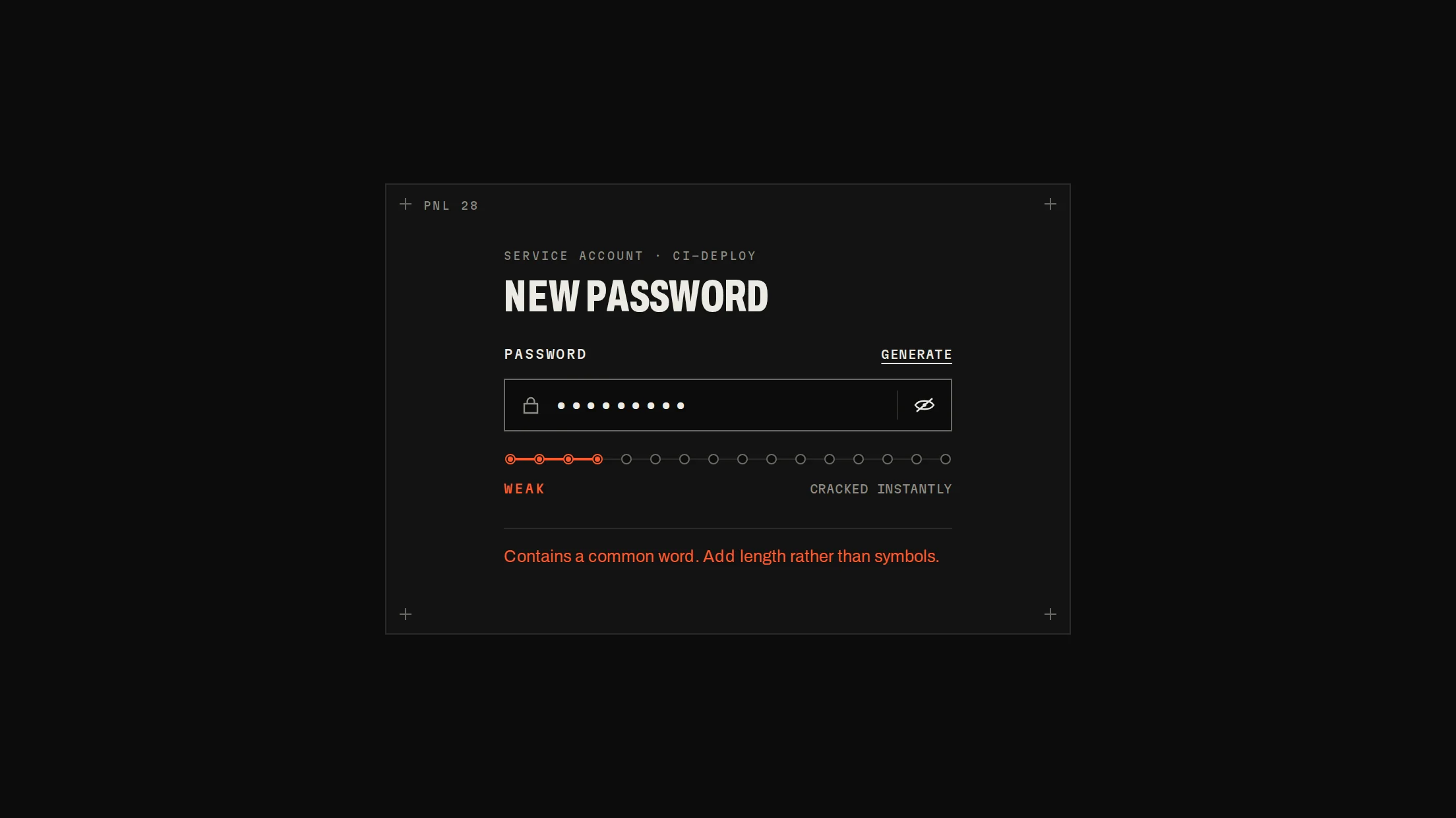
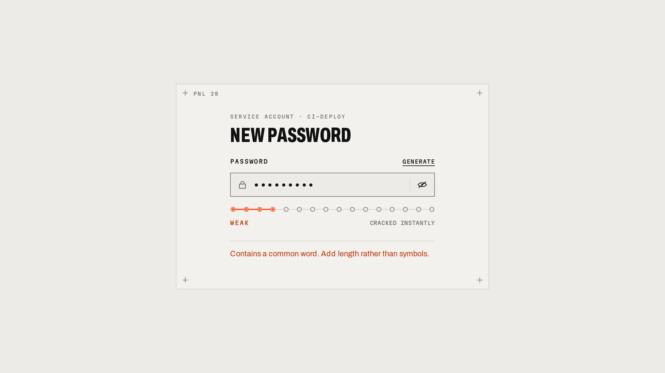
A labelled 40px password field: a lock glyph, mono input tracked wide while masked, a CAPS chip while Caps Lock is on, a show/hide key whose slash draws away, a Forgot link, and a mechanical shake when an attempt is refused.
Live preview
Installation
pnpm dlx shadcn@latest add @beautiful-ui-pro/password-fieldNeeds your registry key. Your components.json style picks the Base UI or Radix build: radix-*, new-york and default get Radix, base-* gets Base UI.
Styles didn't apply?
The CLI adds the styles to the CSS file named in components.json (tailwind.css). Check that it points at your global stylesheet, that the project uses Tailwind CSS v4, and that the file is imported in your root layout. Installed by hand: paste styles.css into that file.
Usage
Import it and pass your content. The props that matter most are listed next.
Example
"use client";

import * as React from "react";
import { PasswordField } from "@/components/ui/notchset/password-field";

export function SignInPassword({ signIn }: { signIn: (password: string) => Promise<boolean> }) {
  const [password, setPassword] = React.useState("");
  const [error, setError] = React.useState<string | undefined>();
  const [attempts, setAttempts] = React.useState(0);
  return (
    <form
      onSubmit={async (e) => {
        e.preventDefault();
        if (await signIn(password)) return;
        setError("That password doesn't match.");
        setAttempts((a) => a + 1);
      }}
    >
      <PasswordField value={password} onValueChange={setPassword} error={error} shake={attempts} forgotHref="/reset" />
    </form>
  );
}
Props
value / onValueChange–string / fnControlled.
error–stringSignal border and help line; sets aria-invalid.
shake–numberBump it to shake on a refused attempt.
revealable / capsLockHint–booleanThe show/hide key and the CAPS chip (both on).
forgotHref / onForgot–string / fnThe Forgot link.
help–ReactNodeThe help line when there is no error.
Source
components/ui/notchset/password-field.tsx
This component is included with Pro.
Try the live preview above. Get Pro to install the source.