App Shell
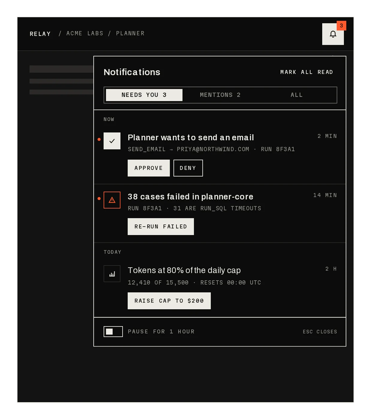
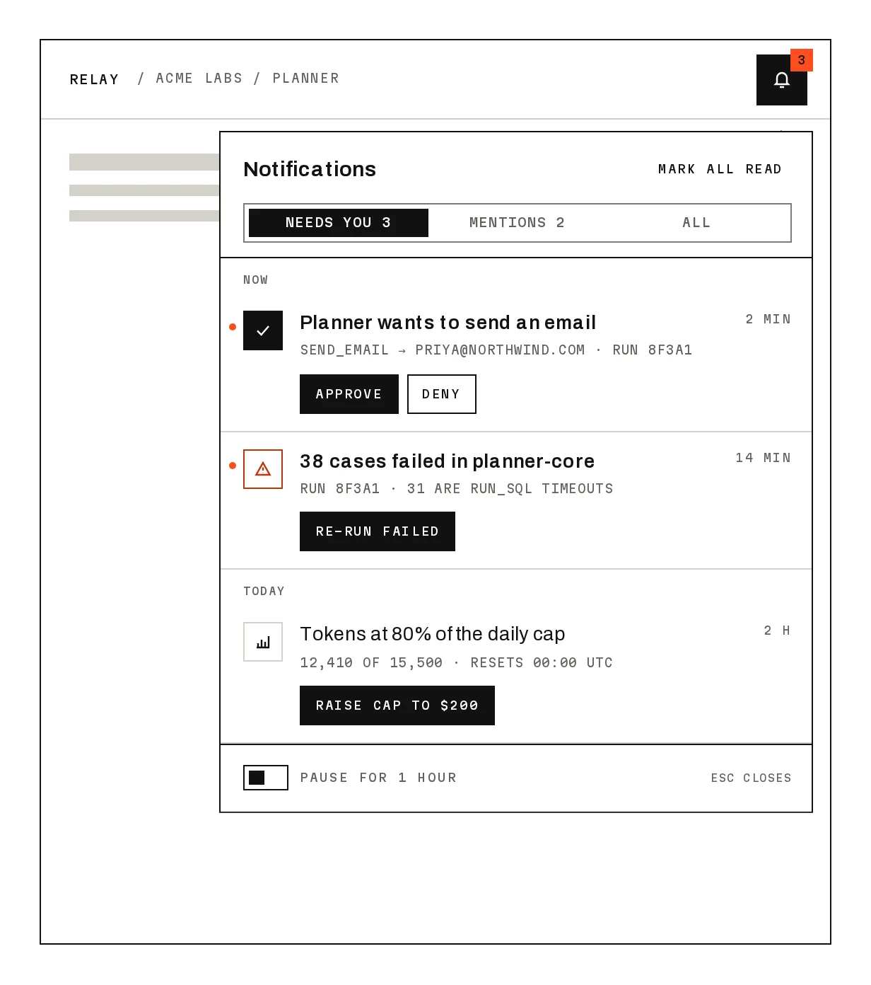
Prov1.0.0The frame for an app: sidebar, workspace switcher, command bar and toasts.
Build for your project
Code/install build
Usage
Import it and pass your content. The props that matter most are listed next.
Example
"use client";

import * as React from "react";
import { AppShell, ShellPage } from "@/components/ui/notchset/blocks/app-shell";

export function Workspace() {
  const [page, setPage] = React.useState("home");
  return (
    <AppShell
      workspaces={[{ id: "acme", initials: "AL", name: "Acme Labs", plan: "TEAM PLAN" }]}
      workspace="acme"
      nav={[
        { items: [{ id: "home", label: "Home", icon: "home" }] },
        { label: "AGENTS", items: [{ id: "planner", label: "Planner", status: "live", meta: "148/MIN" }] },
      ]}
      active={page}
      onNavigate={setPage}
      breadcrumb={`ACME LABS / ${page.toUpperCase()}`}
      user={{ name: "Maya Kerr", initials: "MK", email: "maya@acme.dev", status: "OWNER · ONLINE" }}
      userMenu={[{ id: "out", label: "Sign out", tone: "signal", onSelect: () => "SIGNED OUT" }]}
    >
      <ShellPage title={page} description="Every agent in this workspace." />
    </AppShell>
  );
}
Props
workspaces / workspace / onWorkspaceChange–{ id, initials, name, plan }[]The switcher's menu; switching confirms in a toast.
environments / environment / onEnvironmentChange–{ value, label }[]Optional PROD / STAGING control under the switcher.
nav–{ label?, items: { id, label, icon?, status?, meta? }[] }[]Sections; icon is home, inbox, runs, doc, settings or a node; status (live, paused, degraded) draws the agent node.
active / onNavigate–stringThe current page; Jump to and the nav both call onNavigate.
breadcrumb–stringThe header's path.
user / userMenu–{ name, initials, email, status?, away? } / { id, label, shortcut?, tone?, onSelect? }[]The user row and its menu; return a string from onSelect to confirm it in the toast.
Show all 9 propsShow fewer
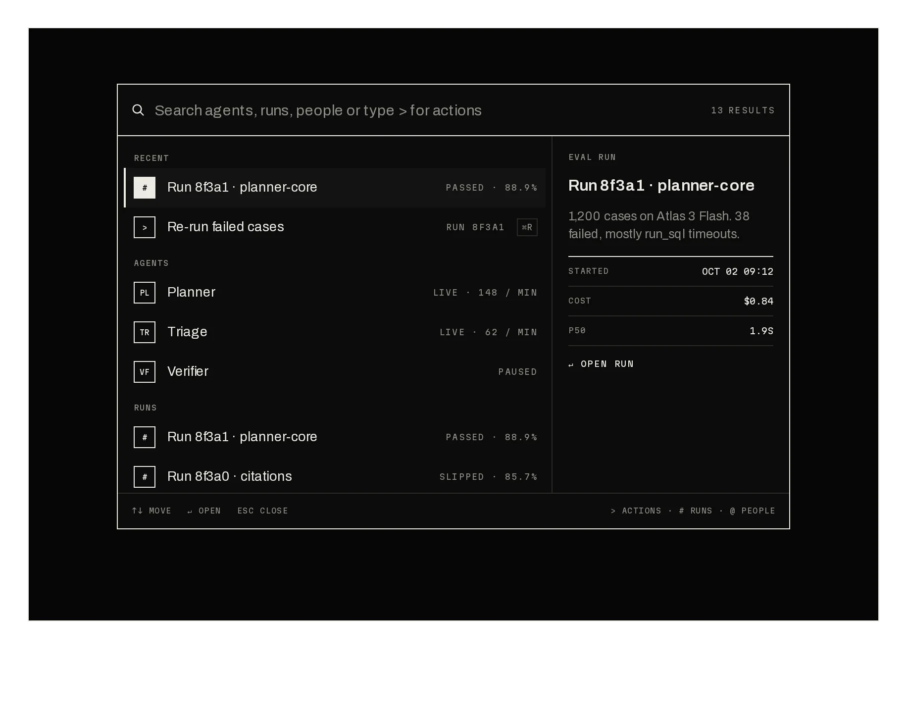
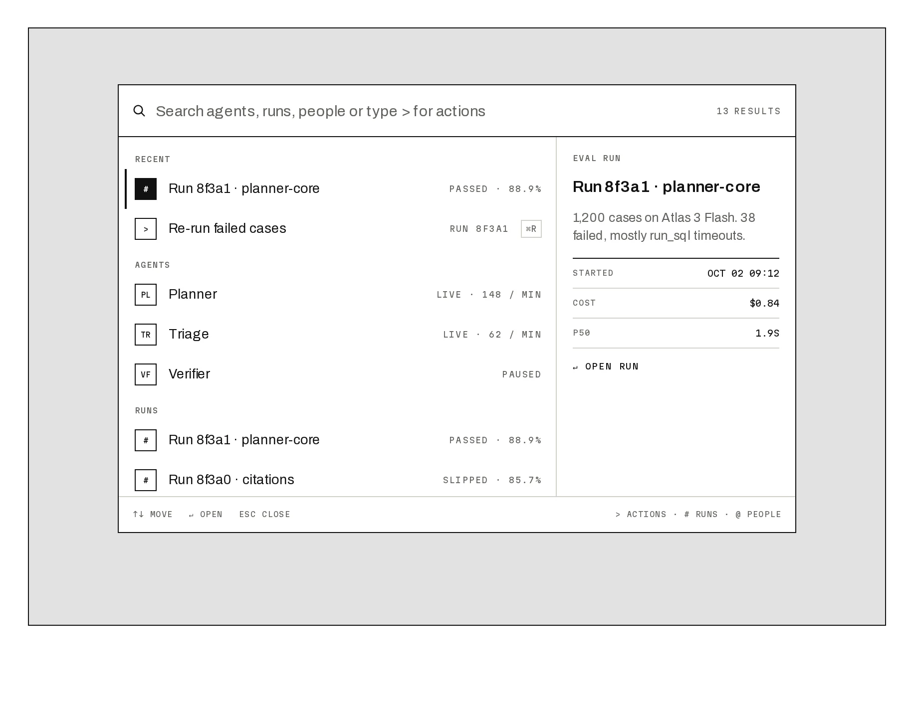
jumpItems–{ id, label, kind }[]What Jump to searches; every nav item by default.
collapsed / defaultCollapsed / onCollapsedChangefalsebooleanThe rail (⌘\). Under 640px the sidebar stays a rail.
children–ReactNodeThe page: compose it from ShellPage, ShellKpis, ShellSection, ShellRow and ShellSwitch, or your own.
Anatomy
- One shell around your pages; the page parts are optional.
- Nav sections carry agent status, so health is visible from every page.
- Menus and Jump to call back to you; toasts confirm what happened.
AppShelldata-slot="app-shell"The shell: sidebar, header, Jump to and toasts.
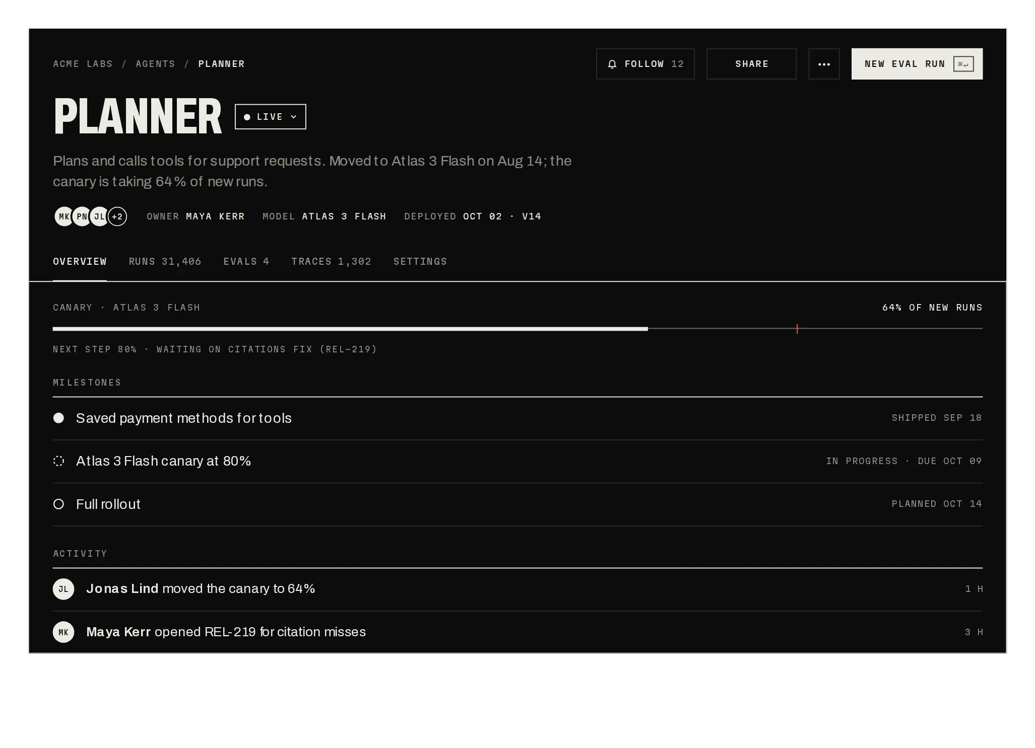
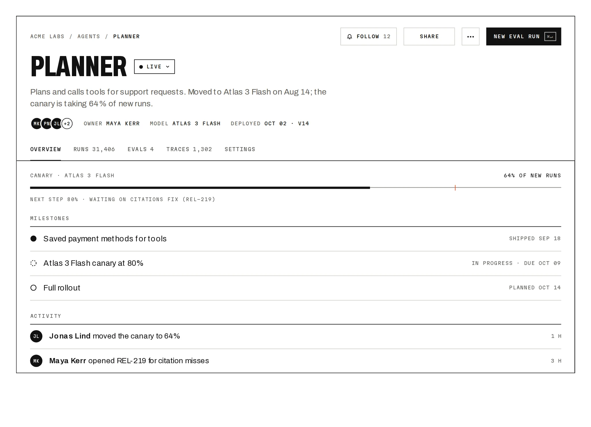
ShellPagedata-slot="shell-page"A page head: status line, condensed title, description.
ShellKpisdata-slot="—"A strip of rolling KPIs.
ShellSectiondata-slot="—"A labelled ruled list.
ShellRowdata-slot="—"A clickable ruled row on your grid.
ShellSwitchdata-slot="—"A settings switch with a stretch thumb.
ShellStatusNodedata-slot="—"Live, paused or degraded.
Source
components/ui/notchset/blocks/app-shell.tsx
This component is included with Pro.
Try the live preview above. Get Pro to install the source.
Build for your project
Code/install build
Installation
pnpm dlx shadcn@latest add @beautiful-ui-pro/app-shellNeeds your registry key. Your components.json style picks the Base UI or Radix build: radix-*, new-york and default get Radix, base-* gets Base UI.
Styles didn't apply?
The CLI adds the styles to the CSS file named in components.json (tailwind.css). Check that it points at your global stylesheet, that the project uses Tailwind CSS v4, and that the file is imported in your root layout. Installed by hand: paste styles.css into that file.
For coding agents
Give your coding assistant the Markdown guide instead of screenshots.
Use it for
- The frame of a product with several areas, especially one that runs agents or jobs whose health matters at a glance
Use something else when
- A marketing site: use Site Header
- A single page with no navigation
Mistakes to avoid
- Give every nav item a page: the reference has no decorative buttons, and neither should yours
- Wrap pages that call useShellToast inside AppShell: the hook reads the shell's context
Agents find it by
- app shell, sidebar layout, dashboard layout, workspace switcher, collapsible sidebar, admin layout, agent status sidebar, Notchset
Where agents read it
- Guide for this component: https://beautiful-ui.dev/md/app-shell.md
- Every component, for tools without MCP: /llms.txt
- MCP server:
https://beautiful-ui.dev/api/mcp(setup)
Behaviour
Keyboard
- ⌘\ / Ctrl+\
- Collapse or expand the sidebar
- ⌘K / Ctrl+K
- Jump to
- ↑ ↓ Home End
- Move in a menu or Jump to
- Enter / Esc
- Open / close
Accessibility
- The sidebar is a nav; the active item has aria-current=page; agent status is spoken, not only drawn
- The workspace and user menus are menus (menuitemradio for workspaces) with arrow keys; Esc closes them and returns focus to their button, and a press outside closes them
- Jump to is a modal dialog (Tab stays inside, the shell behind is inert) with a combobox over a listbox (aria-activedescendant); Esc or a pick closes it and returns focus to its button
- Toasts are announced (role=status); KPI values keep their plain text for screen readers
Motion
- Sidebar
- Collapses to a 58px rail (380ms glide); labels fade (160ms)
- Active item
- Its 2px bar grows from the centre (300ms)
- Menus
- Unroll on grid rows (320ms), roll up faster (180ms)
- Pages
- Each page rises in (260ms); KPI values roll, 60ms apart
- Degraded agent
- Its signal node pulses (1400ms)
Responsive
- Under 640px the sidebar stays a 58px rail; KPI strips go one per row under 520px of page width.
Performance
- Plain DOM; one ResizeObserver for the rail breakpoint. Nothing animates per frame except a degraded node's pulse.
Changelog
v1.0.0 · 2026-10-03
First release
Part of
Included with Pro
Pro is in early access.