Run ButtonProv1.0.0
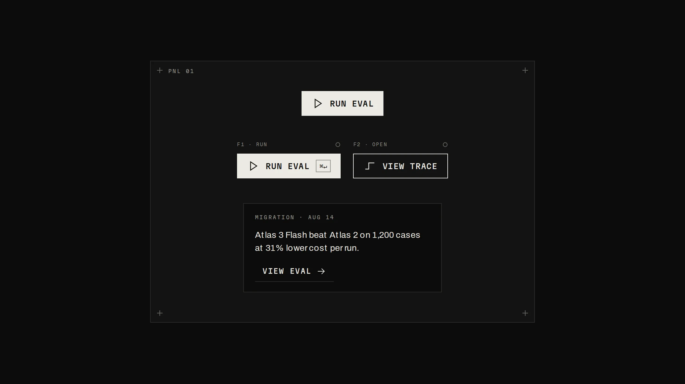
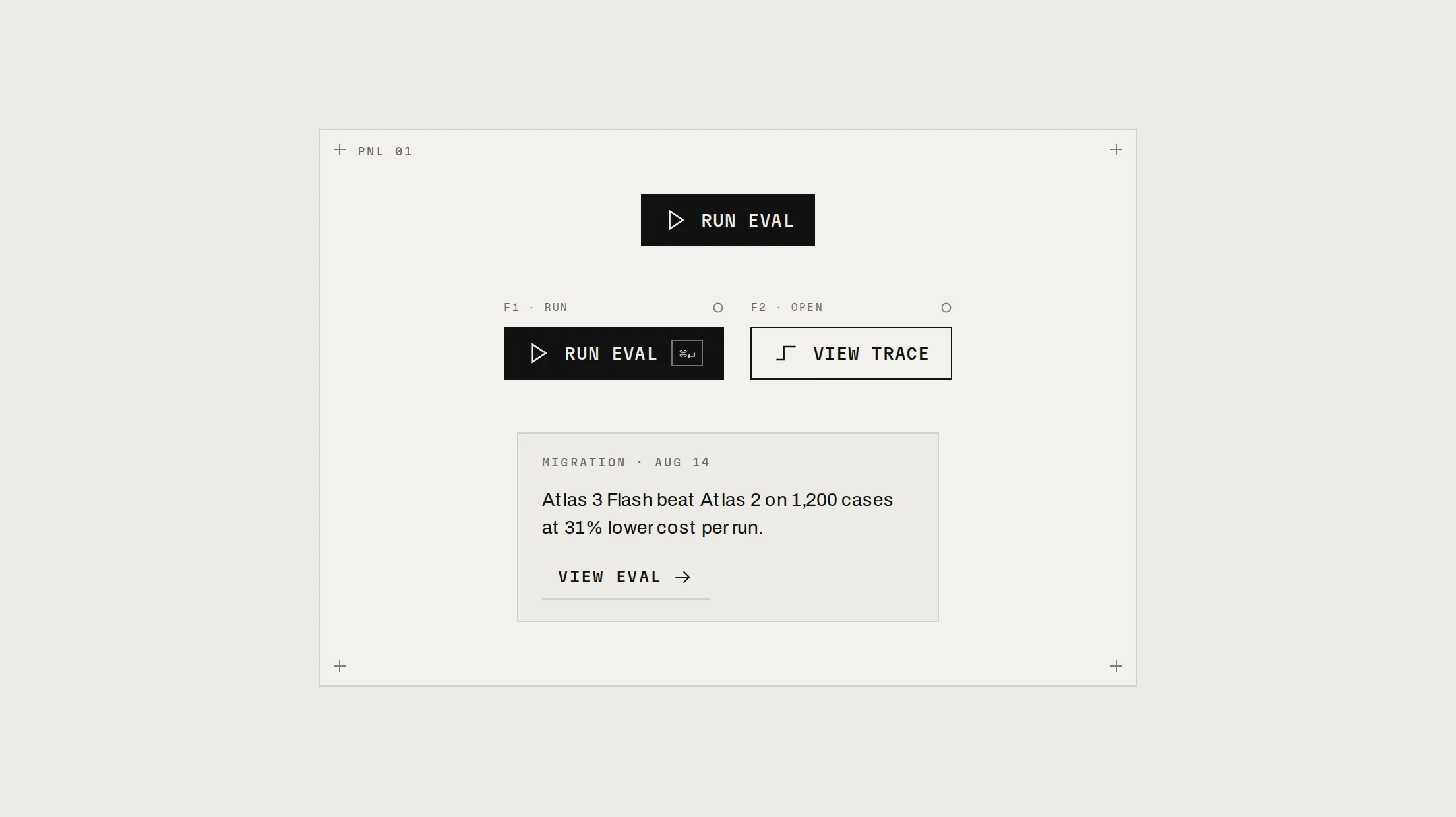
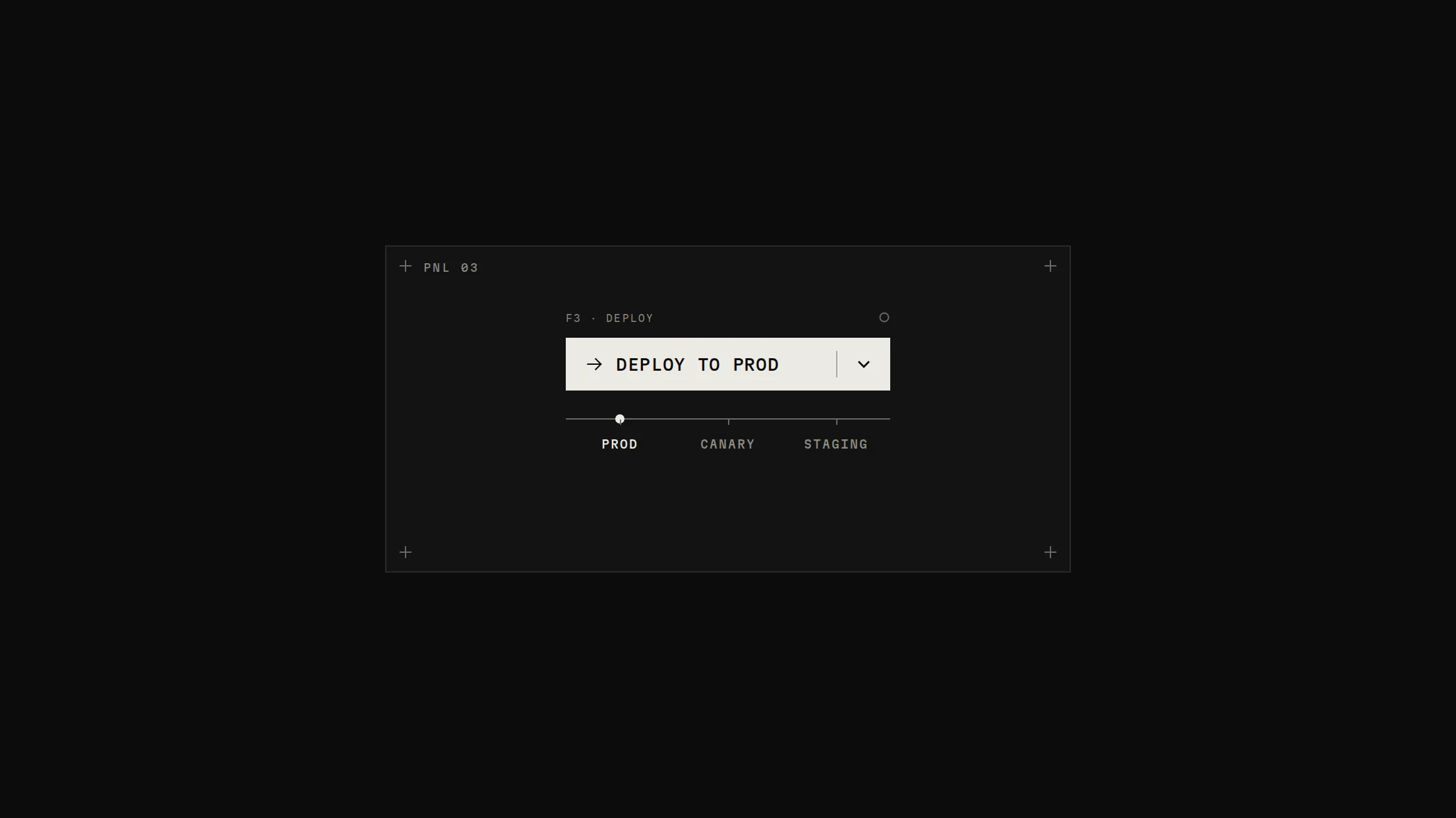
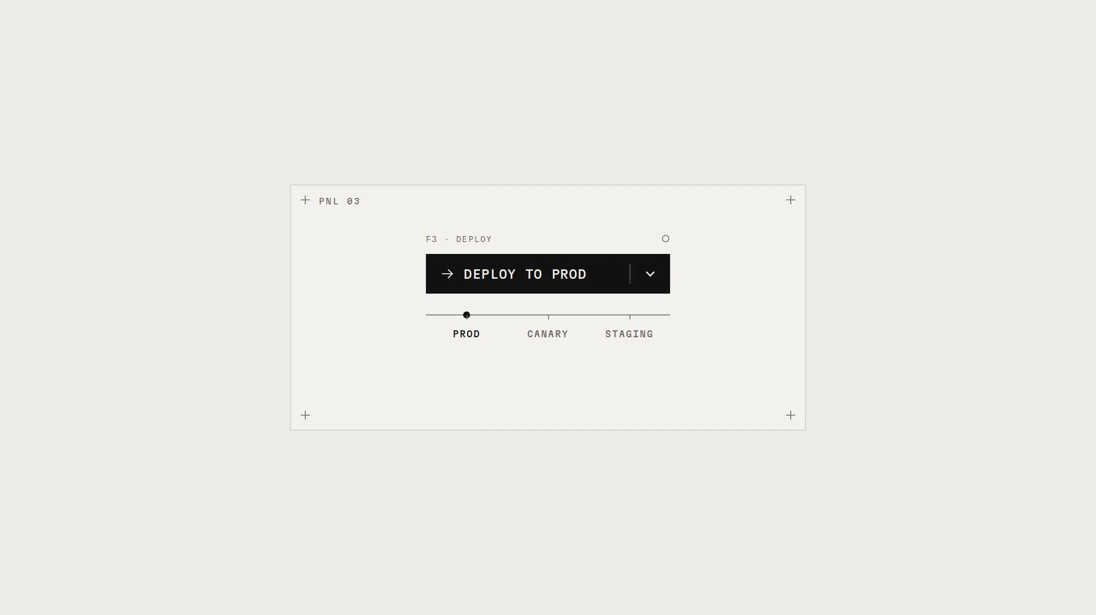
One key that becomes its own stop control: ink with a play glyph and its shortcut, then signal with an elapsed-time readout and a blinking node while the agent runs, a signal outline when stopped, a traced check when complete. A step track and a flipping status line sit under it.
Live preview
Installation
pnpm dlx shadcn@latest add @beautiful-ui-pro/run-buttonNeeds your registry key. Your components.json style picks the Base UI or Radix build: radix-*, new-york and default get Radix, base-* gets Base UI.
Styles didn't apply?
The CLI adds the styles to the CSS file named in components.json (tailwind.css). Check that it points at your global stylesheet, that the project uses Tailwind CSS v4, and that the file is imported in your root layout. Installed by hand: paste styles.css into that file.
Usage
Import it and pass your content. The props that matter most are listed next.
Example
"use client";

import * as React from "react";
import { RunButton } from "@/components/ui/notchset/run-button";

const STEPS = ["plan", "search_docs", "read_file", "run_sql", "draft", "verify"];

/** onRun returns a promise: the key shows running until it settles, and the abort signal stops it. */
export function RunPlanner({ runAgent }: { runAgent: (signal: AbortSignal, onStep: (i: number) => void) => Promise<void> }) {
  const [step, setStep] = React.useState(0);
  return <RunButton legend="F4 · RUN" name="PLANNER" steps={STEPS} step={step} onRun={(signal) => runAgent(signal, setStep)} />;
}
Props
onRun–(signal: AbortSignal) => unknownStarts the run. Return a Promise and the button tracks it; Stop aborts the signal.
onStop–() => voidCalled when the user stops the run.
state–"idle" | "running" | "stopped" | "complete"Controlled state. Uncontrolled, Stopped and Complete hold 2.8s, then return to idle.
steps–string[]The run's steps, drawn as nodes under the key.
step–numberThe current step index.
elapsedMs–numberElapsed time while running; counted by the button when omitted.
Show all 10 propsShow fewer
kbd–stringThe shortcut shown while idle (display only). Default "R".
legend / name–stringThe legend above the key; the first word of the idle status.
status–stringOverrides the status line.
labels–Partial<RunButtonLabels>Every word, for other languages.
Source
components/ui/notchset/run-button.tsx
This component is included with Pro.
Try the live preview above. Get Pro to install the source.