AccordionFreev1.0.0
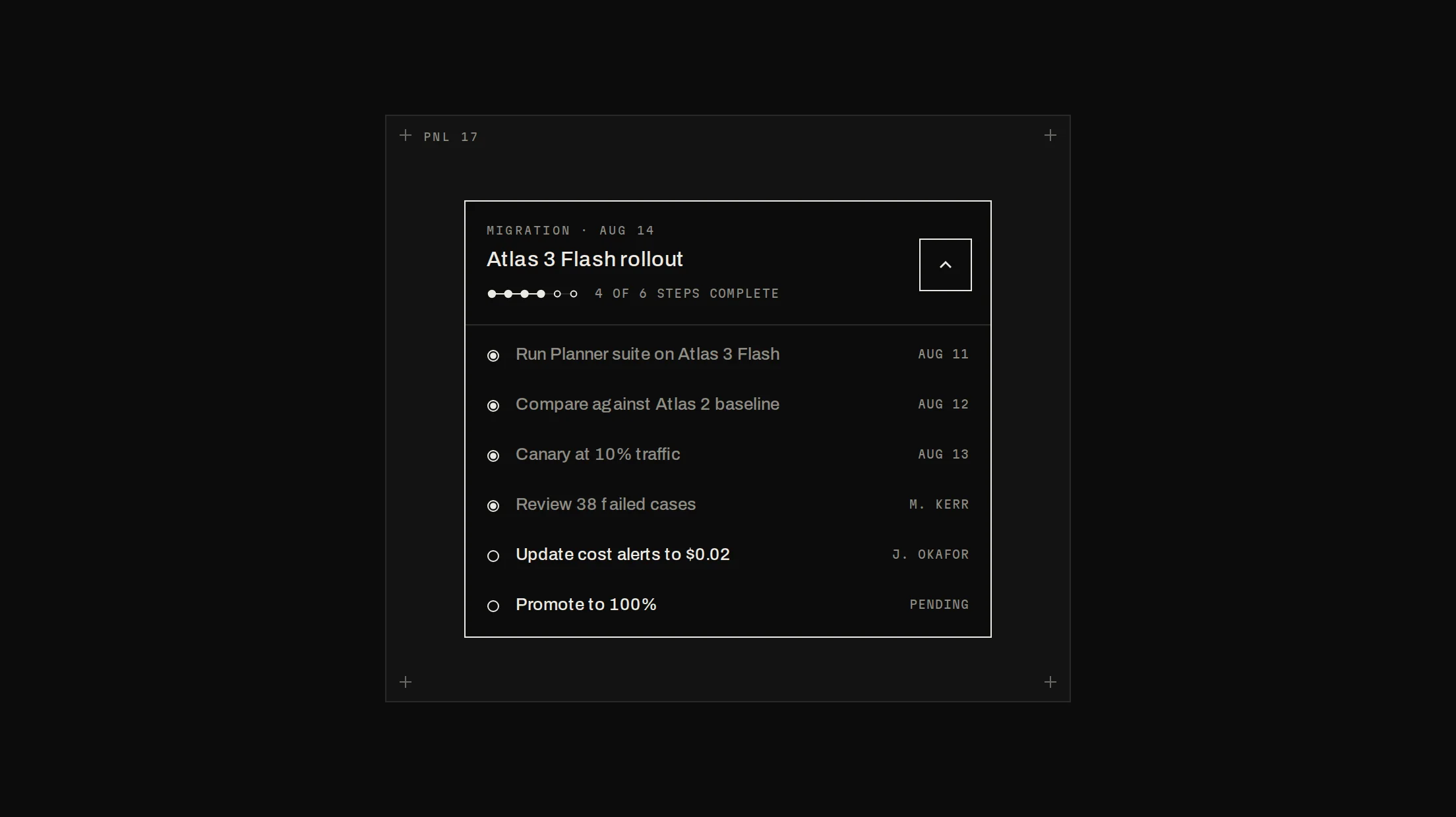
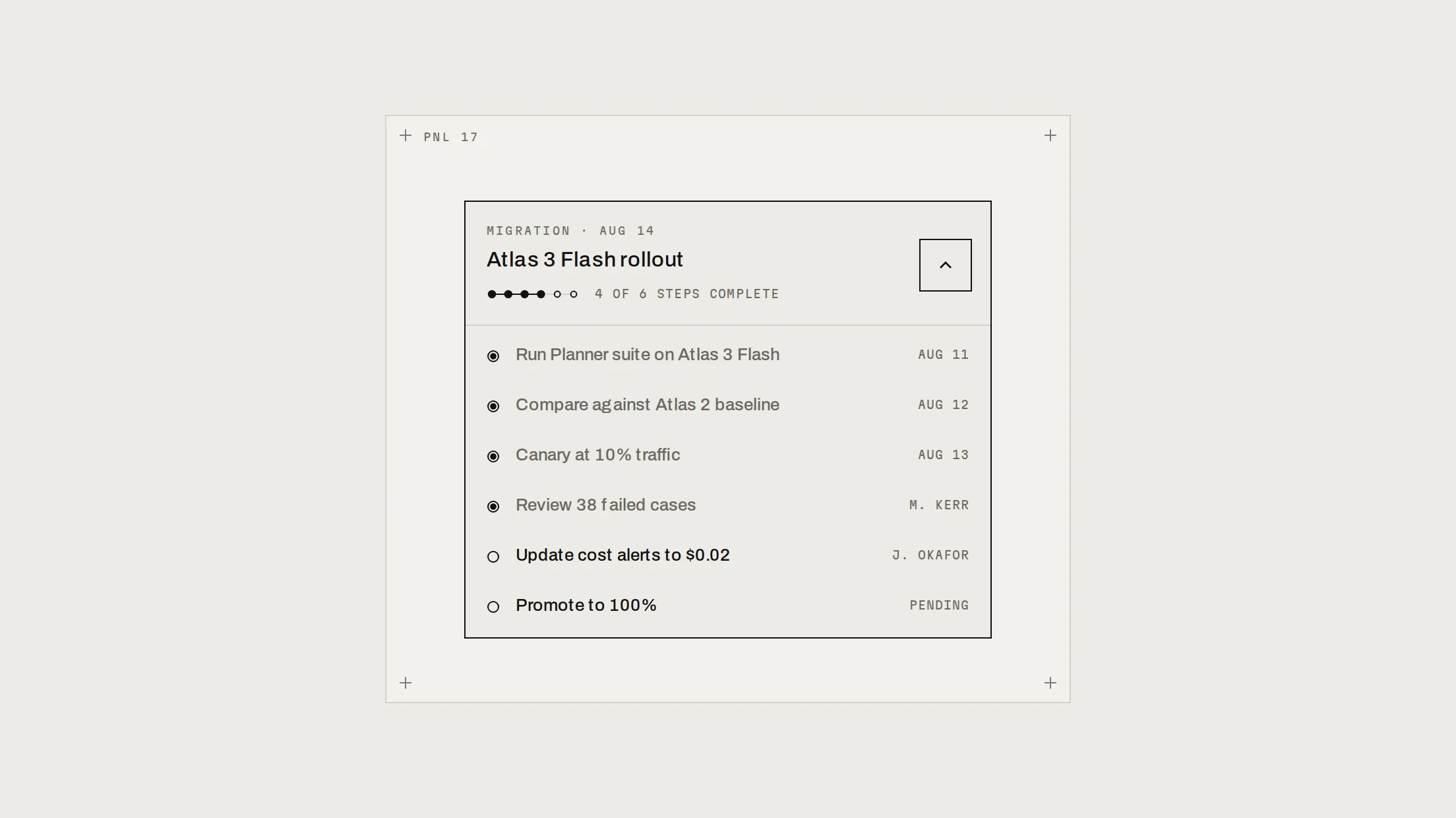
shadcn's Accordion in Notchset: an ink rule on top, indexed triggers (01, 02…) with a plus/minus node whose bar folds away, and panels where a rail traces down to a node that blooms while the answer settles in.
Live preview
Installation
Base UI
pnpm dlx shadcn@latest add https://beautiful-ui.dev/r/accordion.jsonRadix
pnpm dlx shadcn@latest add https://beautiful-ui.dev/r/radix-nova/accordion.jsonFree, no account or key. Use the command for your project's primitives: a radix-*, new-york or default style in components.json is Radix, a base-* style is Base UI. With the @beautiful-ui registry added, @beautiful-ui/<name> picks for you.
Install by hand
- 1. Add the packages
pnpm add @base-ui/react@^1 - 2. Copy the files to these paths (Source below, or save them all as a .zip)
- components/ui/notchset/accordion.tsx
- lib/beautiful-ui/notchset/accordion.tsx
- lib/beautiful-ui/notchset/instrument.tsx
- lib/beautiful-ui/notchset/root.ts
- 3. No stylesheet needed.
- 4. Install what it builds on first: shadcn's cn helper (lib/utils.ts, from npx shadcn init), the theme foundation (its tokens and base styles)
Styles didn't apply?
The CLI adds the styles to the CSS file named in components.json (tailwind.css). Check that it points at your global stylesheet, that the project uses Tailwind CSS v4, and that the file is imported in your root layout. Installed by hand: paste styles.css into that file.
Usage
Import it and pass your content. The props that matter most are listed next.
Example
import { Accordion } from "@/components/ui/notchset/accordion";

<Accordion items={[{ id: "run", title: "What counts as a run?", content: "One request from start to finish." }]} />
Props
Accordion–as the primitivevalue, defaultValue, onValueChange; Base UI multiple, or Radix type and collapsible.
items–{ id, title, content, meta? }[]The whole list in one line.
AccordionContent meta–ReactNodeA mono line under the answer.
Source
components/ui/notchset/accordion.tsx
Loading the code