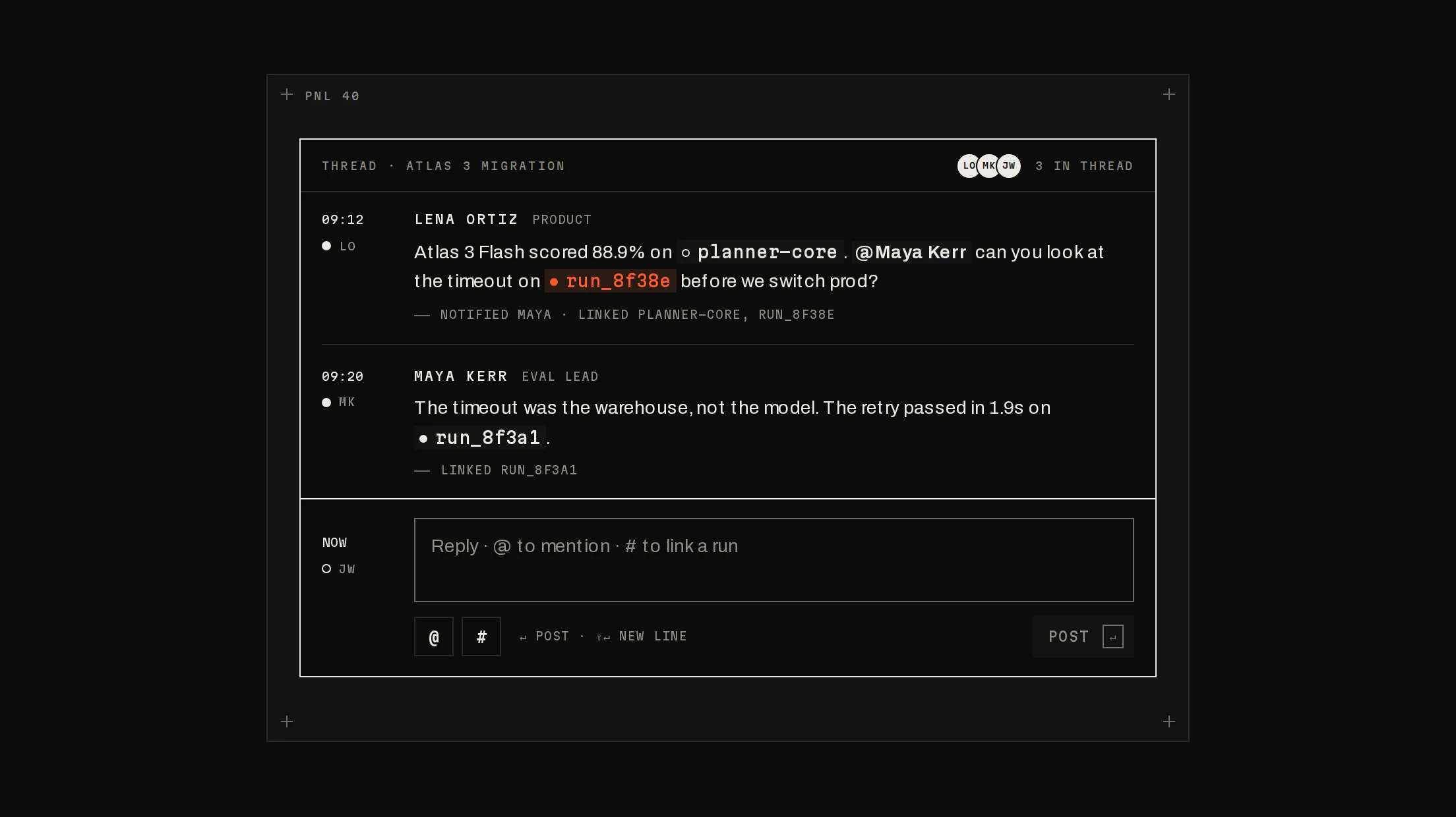
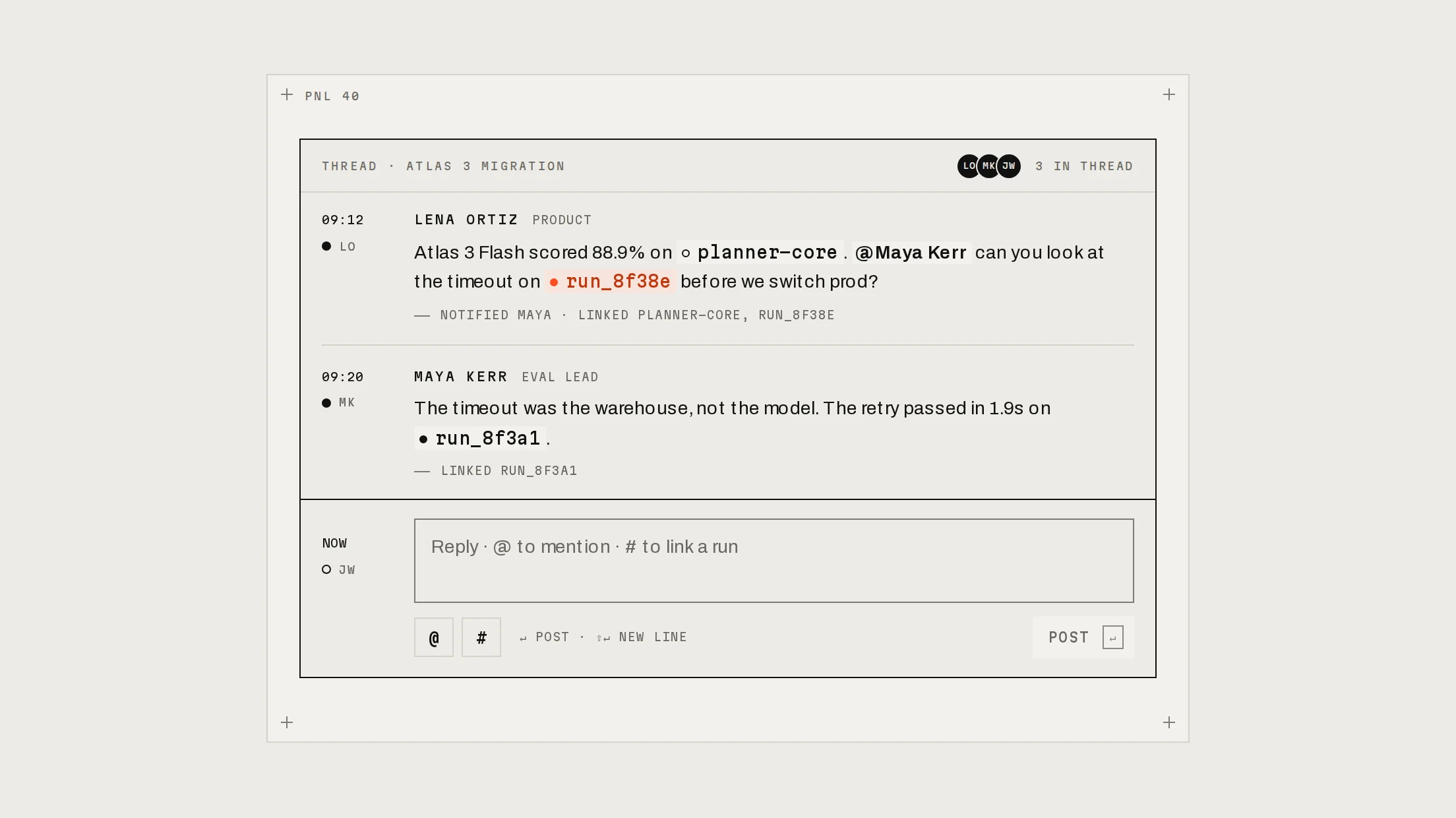
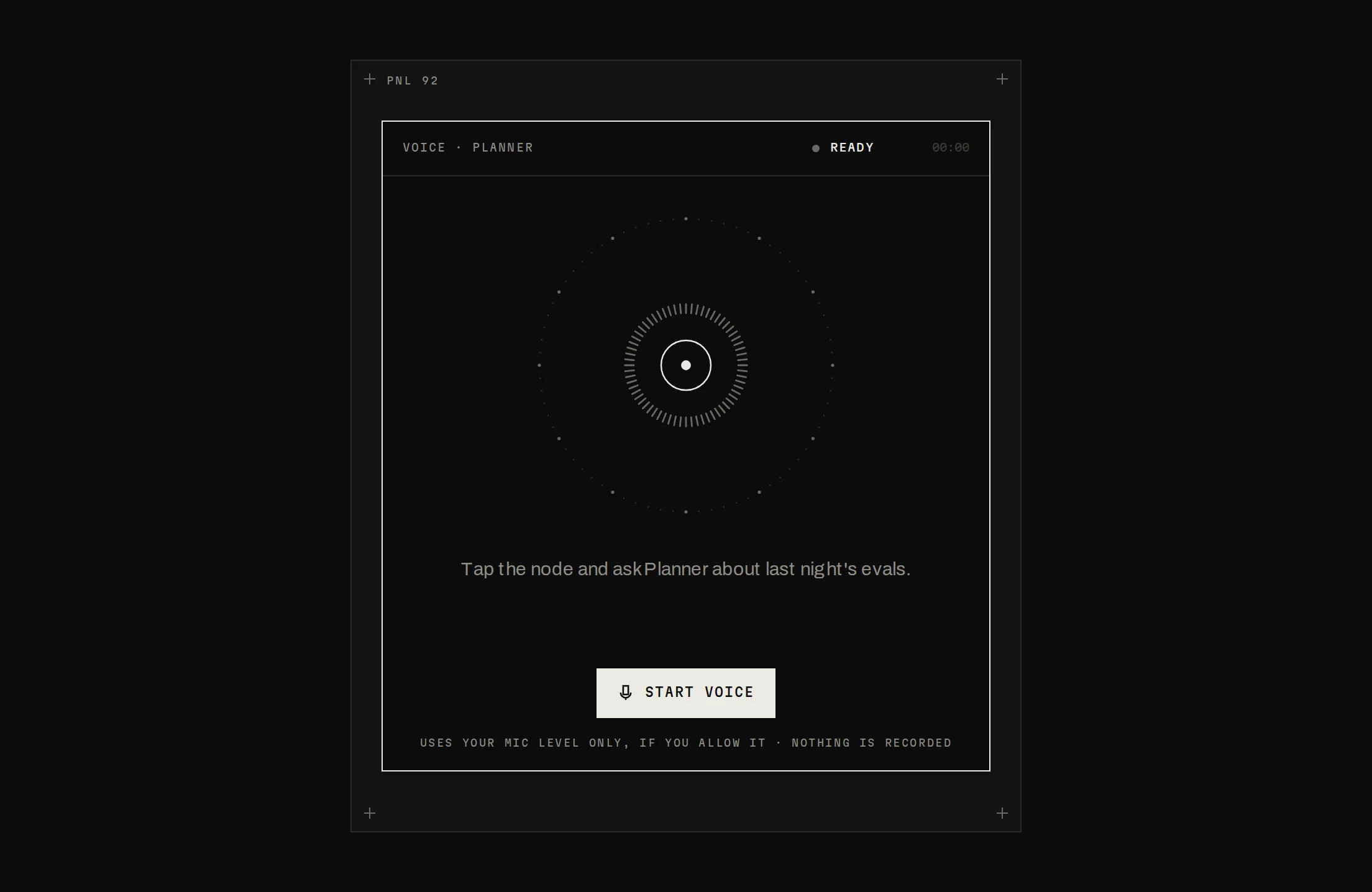
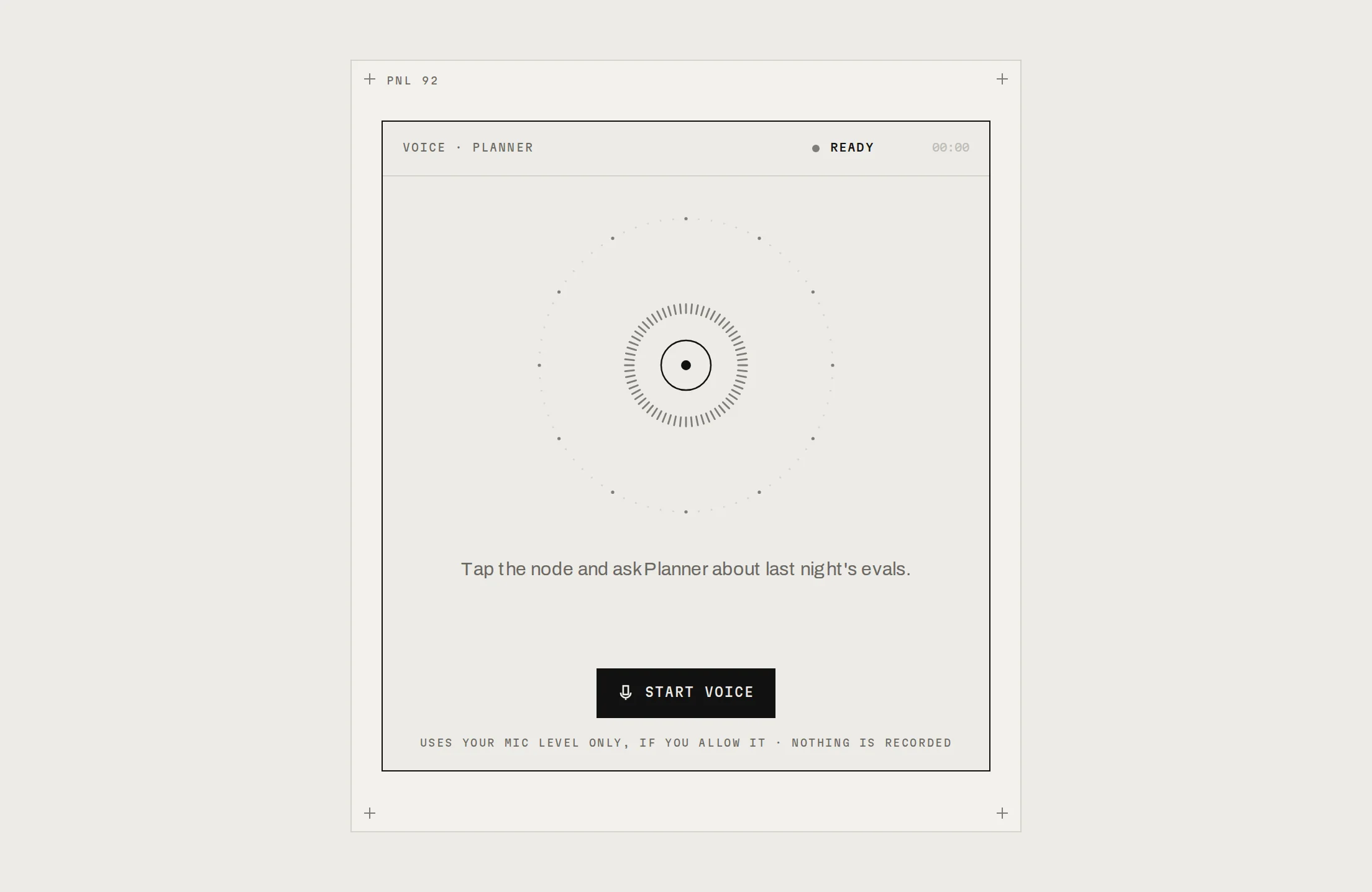
Assistant Panel
Prov1.0.0An assistant inside your product whose answers show their sources and queries.
Build for your project
Code/install build
Usage
Import it and pass your content. The props that matter most are listed next.
Example
"use client";

import * as React from "react";
import { AssistantPanel, type AssistantMessage } from "@/components/ui/notchset/blocks/assistant-panel";

const scopes = [
  { value: "7d", label: "7D" },
  { value: "30d", label: "30D" },
];

export function AskPanel() {
  const [scope, setScope] = React.useState("7d");
  const messages: AssistantMessage[] = [
    { id: "q", role: "user", text: "How much did the migration save?" },
    {
      id: "a",
      role: "assistant",
      status: "done",
      source: { before: "CHECKED", count: "31,406", after: "RUNS" },
      parts: ["It saved ", { value: "$40.83", source: "runs × (0.0020 − 0.0007)", rows: "31,406 RUNS" }, " this week."],
    },
  ];
  return <AssistantPanel title="Ask Relay" scopes={scopes} scope={scope} onScopeChange={setScope} messages={messages} />;
}
Props
title / subtitle–stringThe header: what it is and what it answers from.
scopes / scope / onScopeChange–{ value, label }[] / stringThe time scope (a Segmented Control). On change, pass the answers' new values: every number rolls to them.
messages–({ id, role: 'user', text } | { id, role: 'assistant', status, source?, query?, parts })[]parts mixes text and data tokens ({ value, source, rows }); grow it as the answer streams.
scopeNote–stringUnder each finished answer: what the scope is and that it updates.
followUps–string[]Chips above the composer; disabled while an answer streams.
onAsk / onNewThread–(text) => void / () => voidAsking (send, Enter or a follow-up) and starting over.
Show all 7 propsShow fewer
placeholder / inputLabel–stringThe composer's hint and accessible name.
Anatomy
- One block over a Segmented Control for the scope.
- Answers mix text and data tokens; each token carries its source.
- Scope changes rerun answers in place, so numbers roll instead of reloading.
AssistantPaneldata-slot="assistant-panel"The block: header with scope, the thread, follow-ups and the composer.
Source
components/ui/notchset/blocks/assistant-panel.tsx
This component is included with Pro.
Try the live preview above. Get Pro to install the source.
Build for your project
Code/install build
Installation
pnpm dlx shadcn@latest add @beautiful-ui-pro/assistant-panelNeeds your registry key. Your components.json style picks the Base UI or Radix build: radix-*, new-york and default get Radix, base-* gets Base UI.
Styles didn't apply?
The CLI adds the styles to the CSS file named in components.json (tailwind.css). Check that it points at your global stylesheet, that the project uses Tailwind CSS v4, and that the file is imported in your root layout. Installed by hand: paste styles.css into that file.
For coding agents
Give your coding assistant the Markdown guide instead of screenshots.
Use it for
- An assistant beside a dashboard or record page that answers from the data on it
- Answers whose numbers people will act on and need to check
Use something else when
- A full-page assistant with history: use Chat App
- Free-form chat with no data behind it
Mistakes to avoid
- Pass the new values when the scope changes, keeping each message's id: the numbers roll only if the answer stays mounted
- Give each number its source and rows: the popover is what makes the answer checkable
Agents find it by
- assistant panel, AI sidebar, ask your data, copilot panel, answers with sources, cited numbers, AI side panel, Notchset
Where agents read it
- Guide for this component: https://beautiful-ui.dev/md/assistant-panel.md
- Every component, for tools without MCP: /llms.txt
- MCP server:
https://beautiful-ui.dev/api/mcp(setup)
Behaviour
Keyboard
- Tab
- Scope, the thread, the numbers in each answer, follow-ups, the composer
- ← →
- Change the scope
- Enter
- Ask (ignored while composing with an IME); open or close a query
- Esc
- Close a number's source
Accessibility
- The thread is a log (focusable); an answer is aria-busy until it is done
- The source line is a button that expands the query (aria-expanded)
- Each data token is focusable and describes itself with its source tooltip while open; Esc closes it
- The scope is a radio group with arrow keys (Segmented Control)
Motion
- Scope
- The thumb stretches (340ms); every number rolls to its new value and the answer flashes the highlight (700ms)
- Query
- Opens on grid rows (340ms), closes faster (220ms)
- New answer
- The scanner while checking, then the words as you stream them
- Source
- The popover rises in (180ms)
Responsive
- Designed at 420px and fills its container; user messages wrap at 84% of the width.
Performance
- Plain DOM; numbers roll with CSS transforms. Nothing animates per frame.
Changelog
v1.0.0 · 2026-10-03
First release
Part of
Included with Pro
Pro is in early access.