StepperProv1.0.0
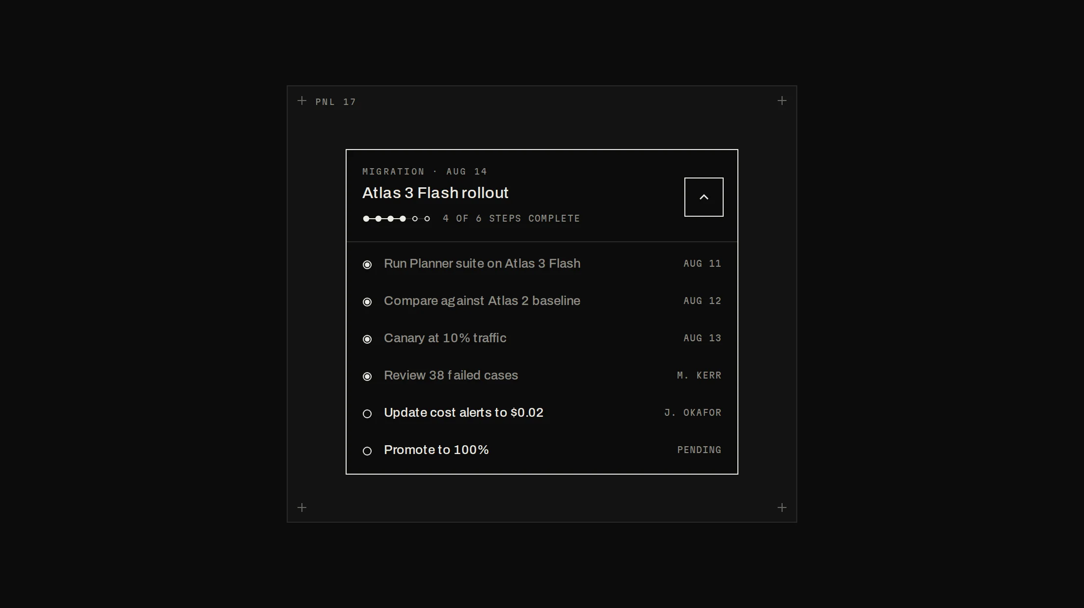
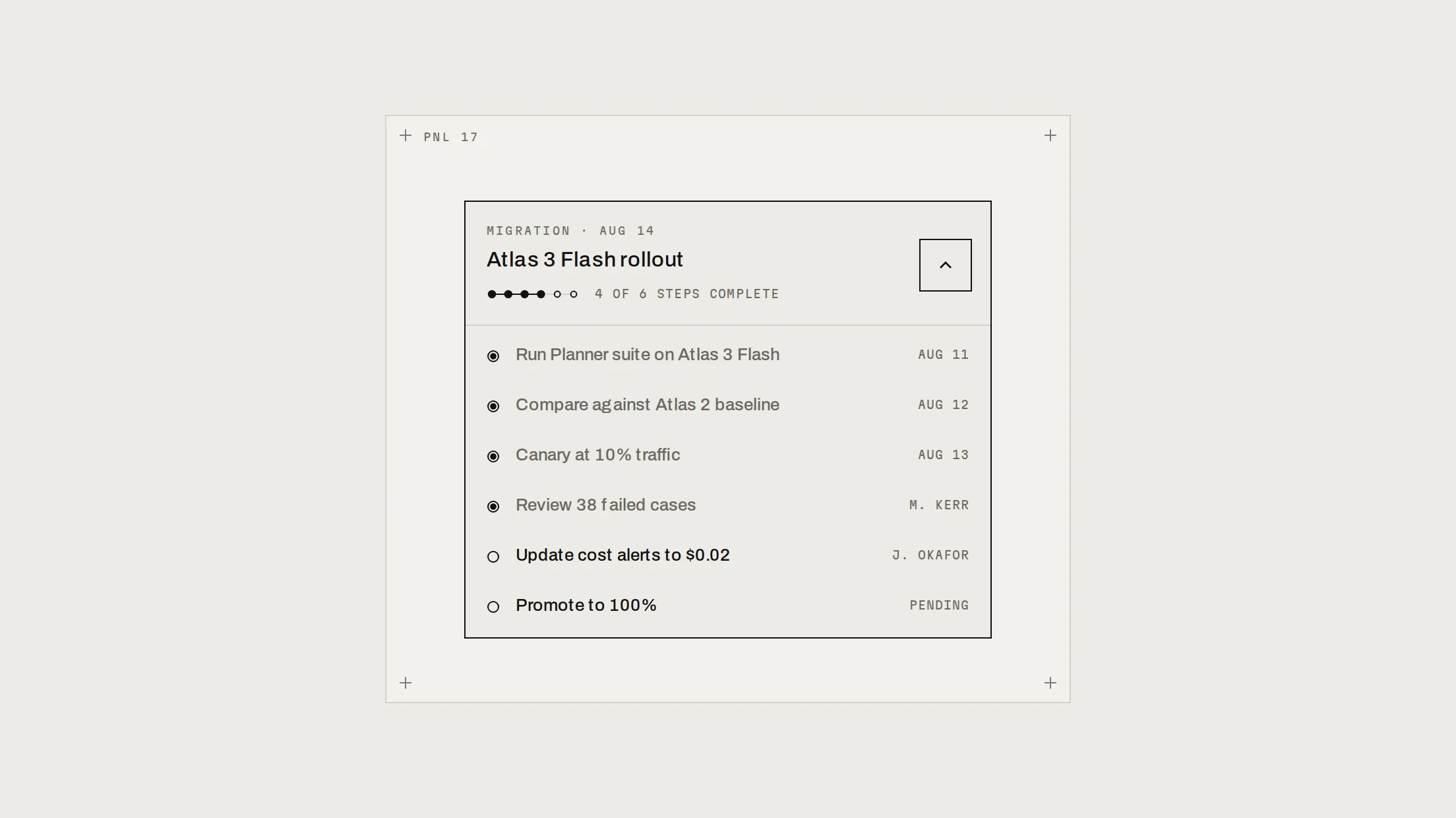
A stepper whose connector traces to the next node before it lights: rings, popping dots and drawn checks, horizontal or vertical, with each step's content sliding in the direction of travel.
Live preview
Installation
pnpm dlx shadcn@latest add @beautiful-ui-pro/stepperNeeds your registry key. Your components.json style picks the Base UI or Radix build: radix-*, new-york and default get Radix, base-* gets Base UI.
Styles didn't apply?
The CLI adds the styles to the CSS file named in components.json (tailwind.css). Check that it points at your global stylesheet, that the project uses Tailwind CSS v4, and that the file is imported in your root layout. Installed by hand: paste styles.css into that file.
Usage
Import it and pass your content. The props that matter most are listed next.
Example
"use client";

import * as React from "react";
import { Stepper, type StepperStep } from "@/components/ui/notchset/stepper";

const steps: StepperStep[] = [
  { label: "Connect", description: "Add your API key" },
  { label: "Pick agents", description: "Planner, Triage" },
  { label: "Run evals", description: "1,200 cases" },
];

export function Onboarding() {
  const [step, setStep] = React.useState(1);
  return (
    <div className="grid gap-3">
      <Stepper steps={steps} value={step} orientation="horizontal" />
      <button type="button" onClick={() => setStep((s) => Math.min(steps.length, s + 1))}>
        Next
      </button>
    </div>
  );
}
Props
steps–{ label, description?, content? }[]The steps and what each shows.
value–numberThe current step.
complete–booleanEvery step done.
orientation–"horizontal" | "vertical"Content below a rule, or inline under the current step.
Source
components/ui/notchset/stepper.tsx
This component is included with Pro.
Try the live preview above. Get Pro to install the source.