Expandable CardProv1.0.0
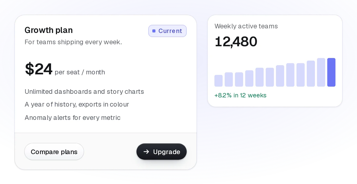
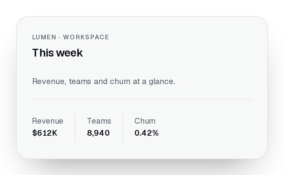
A card that opens into its full story: the detail panel grows out of the card's own outline with the page dimmed behind, and Escape, the close button or a click outside put it back with focus on the card.
pnpm dlx shadcn@latest add @beautiful-ui-pro/lumen-expandable-cardNeeds your registry key. Your components.json style picks the Base UI or Radix build: radix-*, new-york and default get Radix, base-* gets Base UI.
Styles didn't apply?
The CLI adds the styles to the CSS file named in components.json (tailwind.css). Check that it points at your global stylesheet, that the project uses Tailwind CSS v4, and that the file is imported in your root layout. Installed by hand: paste styles.css into that file.
Usage
Import it and pass your content. The props that matter most are listed next.
Example
"use client";

import { ExpandableCard } from "@/components/ui/lumen/controls/expandable-card";

export function CaseStudies() {
  return (
    <div className="grid gap-4 sm:grid-cols-2">
      <ExpandableCard
        eyebrow="Case study"
        title="Signup, rebuilt"
        description="How a team of four halved drop-off in six weeks."
        media={<img src="/cases/signup.jpg" alt="" />}
      >
        <p>They started by watching ten people sign up, and cut every field nobody needed on day one.</p>
        <p>Drop-off fell from 41% to 19%.</p>
      </ExpandableCard>
    </div>
  );
}
Props
title–ReactNodeOn the card, and the panel's title.
description–ReactNodeThe summary on the card, and the panel's description.
eyebrow–ReactNodeA small label above the title.
media–ReactNodeArtwork at the top of the card, larger in the panel. Give images alt="": the title names them.
children–ReactNodeThe detail, rendered only while open.
open / defaultOpen / onOpenChange–boolean / boolean / (open: boolean) => voidControlled or uncontrolled.
Show all 7 propsShow fewer
panelClassName–stringClasses for the open panel.
Source
components/ui/lumen/controls/expandable-card.tsx
This component is included with Pro.
Try the live preview above. Get Pro to install the source.