Async ButtonFreev1.0.0
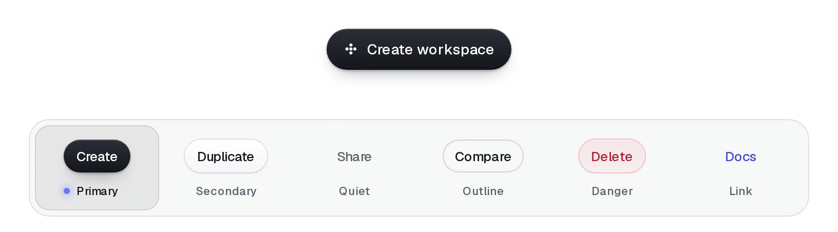
Give it the work and it shows the rest: onClick's promise drives the button through working, done and failed, then it's ready again. No loading flags in your component, and a second press while it runs does nothing.
Base UI
pnpm dlx shadcn@latest add https://beautiful-ui.dev/r/lumen-async-button.jsonRadix
pnpm dlx shadcn@latest add https://beautiful-ui.dev/r/radix-nova/lumen-async-button.jsonFree, no account or key. Use the command for your project's primitives: a radix-*, new-york or default style in components.json is Radix, a base-* style is Base UI. With the @beautiful-ui registry added, @beautiful-ui/<name> picks for you.
Make it fail
Usage
Import it and pass your content. The props that matter most are listed next.
Example
import { AsyncButton } from "@/components/ui/lumen/controls/async-button";

<AsyncButton onClick={() => saveSettings(form)} doneLabel="Saved">Save settings</AsyncButton>
Props
motion"full""full" | "subtle" | "off"As on Button: subtle is shorter on a calm curve; off is instant. Reduced motion is respected automatically.
onClick–(event) => unknownThe work. Return a promise; a rejection or throw shows the error state.
children–ReactNodeThe label.
doneLabel / errorLabelthe label / "Try again"ReactNodeAfter success or failure.
resetMs2000numberHow long the result shows.
onError–(error) => voidReceives the failure, for logging or a toast.
Show all 7 propsShow fewer
variant / size / icon–Button propsAs on Button.
Source
components/ui/lumen/controls/async-button.tsx